 DesignMind AI
This is an example review. Start your own.
Quick Walk-through
A finished example review of Fernway Learn, an online platform with AI skills courses and an AI tutor, for Working professionals moving into AI roles.
- Model:
- google/gemini-3.8-flash
Product tour
A short, silent walkthrough: adding screenshots on the home page, then exploring this review's pins and tabs.
Steps
7 of 7 steps finished
- 1Image searchFinds screens from real, well-rated apps that look like your design45sDone
- 2Visual analysisLayout, spacing, colour, type and hierarchy17sDone
- 3UX critiqueNielsen’s 10 usability heuristics20sDone
- 4AccessibilityMeasures contrast and sizes against WCAG 2.222sDone
- 5Market researchSearches the web for competitors and trends60sDone
- 6Design comparisonPicks the stronger design in each area5sDone
- 7Lead reviewerRemoves repeats, ranks the fixes and scores each design18sDone
The 5 indented agents work at the same time.
Marked-up design
Pins show the top 10 ranked fixes. Hover over or tap a pin to see the fix.
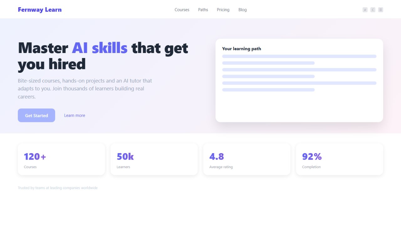
Hover over or tap a pin to see the fix.
- 1P0 Increase text contrast on hero primary CTA button 'Get Started' to at least 4.5:1
- 3P0 Darken hero body copy to achieve at least 4.5:1 contrast against the pastel gradient background
- 5P1 Replace blank skeleton lines in 'Your learning path' card with realistic curriculum milestones and AI tutor artifacts
- 6P1 Darken 'Trusted by teams' proof copy to satisfy minimum 4.5:1 text contrast
- 10P2 Replace top-right navigation icon controls with high-contrast, labeled actions such as 'Log in'
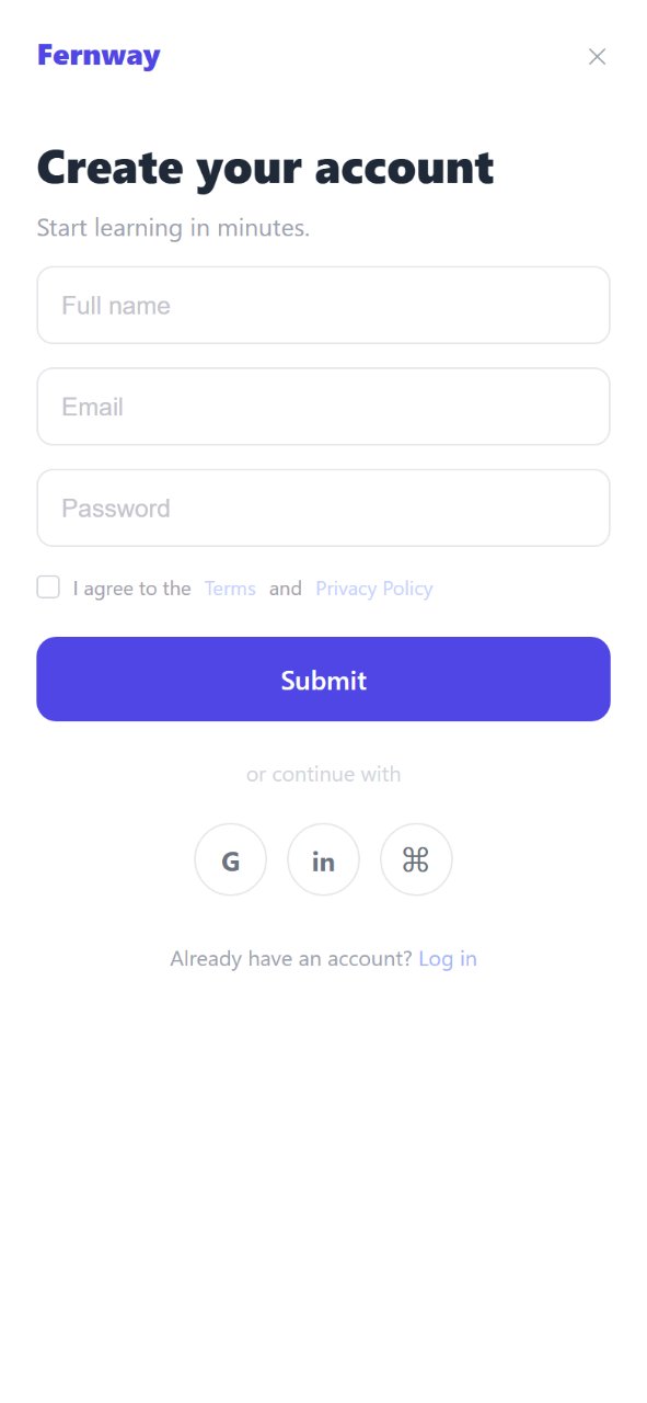
Hover over or tap a pin to see the fix.
- 2P0 Add persistent visible text labels above form inputs and increase placeholder/text contrast
- 4P1 Change the registration modal primary CTA label from 'Submit' to 'Create account'
- 7P1 Increase target size and contrast for modal 'Close dialog' button
- 8P1 Darken Terms of Service checkbox label and login footer link on registration modal
- 9P1 Replace ambiguous command loop icon with recognized OAuth provider branding and accessible labels
Executive summary
Fernway Learn presents a contemporary, clean aesthetic tailored to career-driven AI upskilling, featuring a structured landing hero and a focused registration modal. However, severe accessibility failures compromise both screens: primary CTA buttons, input placeholders, and body copy fail WCAG contrast minimums, with ratios as low as 1.48:1 and 1.80:1. Usability is further hampered by vanishing input labels, a generic 'Submit' button label, and empty skeleton wireframe cards that fail to showcase the platform's core AI tutor value proposition. Addressing these contrast deficits and replacing generic placeholders with authentic interactive course previews will significantly improve conversion and trust.
Landing page
72Mobile sign-up
72Ranked fixes
- 1
Increase text contrast on hero primary CTA button 'Get Started' to at least 4.5:1
The white text on light indigo background measures 1.95:1 (#f5feff on #a5b4fd), failing WCAG 2.2 SC 1.4.3 and rendering the primary landing page conversion button illegible for many users.
P0Impact highEffort SOwner devScreen AFound by Accessibility
Sources:wcag-contrast-text
- 2
Add persistent visible text labels above form inputs and increase placeholder/text contrast
Inputs for 'Full name', 'Email', and 'Password' lack persistent labels and measure only 1.80:1–1.81:1 (#c1c0c4 on #ffffff). Disappearing labels cause cognitive load during entry, violating WCAG 1.3.1 and 1.4.3.
P0Impact highEffort SOwner designScreen BFound by UX critique, Visual analysis, AccessibilityDraws on Codecademy
Sources:wcag-labelsformsscreen-B#1wcag-contrast-text
- 3
Darken hero body copy to achieve at least 4.5:1 contrast against the pastel gradient background
The subhead copy measures 2.41:1 (#9b9ead on #f3f2fd), failing WCAG 2.2 SC 1.4.3 and creating severe readability issues for prospective learners evaluating the value proposition.
P0Impact highEffort SOwner devScreen AFound by Accessibility
Sources:wcag-contrast-text
- 4
Change the registration modal primary CTA label from 'Submit' to 'Create account'
'Submit' is non-descriptive and generic; using action-oriented language clearly indicates the outcome of account creation and aligns with modern onboarding standards.
P1Impact medEffort SOwner designScreen BFound by Visual analysis, UX critiqueDraws on DataCamp
Sources:craft-writing-labelsforms
- 5
Replace blank skeleton lines in 'Your learning path' card with realistic curriculum milestones and AI tutor artifacts
The preview card displays abstract skeleton placeholder bars with empty whitespace below, failing to demonstrate tangible course outcomes, adaptive tutoring features, or career tracks.
P1Impact highEffort MOwner designScreen AFound by Visual analysis, UX critiqueDraws on Coursera
Sources:craft-herocraft-subjectempty-states
- 6
Darken 'Trusted by teams' proof copy to satisfy minimum 4.5:1 text contrast
Text measures 1.48:1 (#d0d4d8 on #fdfefe), making social proof almost invisible to prospective users and failing WCAG 2.2 SC 1.4.3.
P1Impact medEffort SOwner devScreen AFound by Visual analysis, Accessibility
Sources:craft-quality-floorwcag-contrast-text
- 7
Increase target size and contrast for modal 'Close dialog' button
The close button has an estimated target size of only 12×15 CSS px (failing SC 2.5.8) and measures 2.68:1 (#9b9ea0 on #fefefe, failing SC 1.4.11), posing tap and visibility barriers.
P1Impact medEffort SOwner devScreen BFound by Accessibility
Sources:wcag-non-text-contrastwcag-target-size
- 8
Darken Terms of Service checkbox label and login footer link on registration modal
The legal label measures 2.64:1 (#a09ea2 on #fefefe) and login text measures 2.70:1 (#9b9ca2 on #fdfefe), both failing WCAG 2.2 SC 1.4.3 and causing legal/navigation illegibility.
P1Impact medEffort SOwner devScreen BFound by Accessibility
Sources:wcag-contrast-textwcag-target-size
- 9
Replace ambiguous command loop icon with recognized OAuth provider branding and accessible labels
The third SSO button displays an abstract loop (⌘) rather than a recognizable provider (like GitHub or Apple), and buttons lack explicit accessible names for screen reader users.
P1Impact medEffort SOwner designScreen BFound by UX critique, AccessibilityDraws on Codecademy
Sources:wcag-labelsscreen-B#2
- 10
Replace top-right navigation icon controls with high-contrast, labeled actions such as 'Log in'
The header icons measure 2.07:1 non-text contrast (#b3b3b9 on #fefefe) and fail SC 2.5.8 target size (76×16 px), while lacking visible labels or clear sign-in affordances.
P2Impact lowEffort SOwner designScreen AFound by UX critique, AccessibilityDraws on DataCamp
Sources:wcag-non-text-contrastwcag-target-sizewcag-labelsscreen-A#1
- 11
Adjust text contrast and tap targets on header 'Courses' and 'Learn more' links
'Courses' measures 4.20:1 (#797b7f on #fdfefe) and 'Learn more' measures 4.08:1 (#716ebc on #f3f3fe), falling just short of the 4.5:1 requirement.
P2Impact lowEffort SOwner devScreen AFound by Accessibility
Sources:wcag-contrast-textwcag-target-size
- 12
Standardize hero headline typography to a uniform high-contrast color
Splitting the headline with periwinkle colored spans ('AI skills') follows a generic SaaS template trope that dilutes typographical hierarchy compared to weight-based emphasis.
P2Impact lowEffort SOwner designScreen AFound by Visual analysis
Sources:craft-typography
Quick wins
- Update primary button copy on Screen B from 'Submit' to 'Create account'.
- Darken 'Get Started' button background or text color on Screen A to meet 4.5:1 contrast.
- Add persistent text labels above Full Name, Email, and Password form fields on Screen B.
- Darken secondary microcopy ('Trusted by teams...', 'Start learning in minutes.', and Terms label) to satisfy WCAG AA.
- Expand clickable padding on modal close button and header navigation icons to 44×44 px minimum.